Covid-19-visualizations
Visualizations of the Covid-19 situation as it unfolds.
Post your favorite visualizations, make sure to explain the important aspects.
Links to great visualizations are also welcome!
Generally: add what you want, but if you break it you fix it :)
John Hopkins and the NY Times are posting up-to-date information about the number of Covid-19 cases.
License
This work is licensed under a Creative Commons Attribution 4.0 International License.
Examples
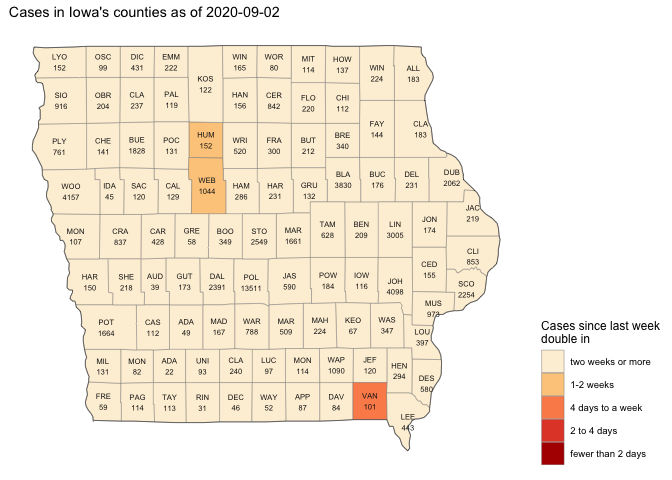
This chart shows the number of cases in Iowa - fill color shows recent trend (last week) of the number of days in which cases double.

Here are a few of the charts, focusing on Iowa, that Ian has made, using the NYT data, current data from the state, and county-population data.
First is shows counties with large numbers of cases, also showing aggregations for the state as a whole, as well as for counties not otherwise shown:

We can remake this plot in the style of FT charts:

What I’m seeing here is that counties race out of the gate, then settle down to a doubling-rate between a week to two-weeks. This was the case until April 19, where I am seeing an across-the-board increase. Almost 400 new cases reported on Apr. 19, doubling the previous record. According to the governor, roughly two-thirds of these 400 cases are associated with targeted testing at meat-packing plants (Louisa, Tama, and Black Hawk).
Again, following the style of FT, we can look at the seven-day rolling average of new cases:

As of 2020-04-20, I am not seeing a peak in new-cases being approached.
Focusing on Johnson County, I see four waves of increases:
- days 0-7: the initial cases associated with the Egyptian cruise
- days 7-23: the establishment of community-spread
- days 23-38: another rise perhaps associated with spring-breakers returning
- days 38- : another uptick
Another interesting case is Dallas County, known as being the fastest-growing county in the state, i.e. suburban Des Moines:
- days 0-16: new cases diminish, perhaps folks who have the means to isolate are doing so.
- days 17- : there is a meat-packing plant in Perry with an outbreak.
Another question I want to ask deals with differences between large counties and and small counties. My idea was to split the counties into groups, according to population. Each group of counties has approximately the same population:

Essentially, a quarter of the state’s population lives in the two most-populous counties. Also, about a quarter of the state’s population lives in the sixty-or-so least-populous counties.
This lets us compare counts among the different county-groups:

The proportion of reported cases is not terribly different from the proportion of the population itself. That said, the largest counties account for a little more than half the deaths; I think this is due to the long-term care outbreaks, particularly in Linn County.
Finally, I’d like to show the seven-day rolling average of new-cases, according to group:

This suggests to me that, since the last week of March, roughly the same things are happenning all over the state, regardless of the county-group. It could be that larger counties have more long-term care facilites and that smaller counties have more meat-packing plants.
Since about April 18, I am starting to see a divergence in the rate of new cases among the groups. I suspect this is because Black Hawk and Woodbury counties, mid-large counties, each have significant outbreaks associated with meat-packing plants.
This is my opinion, but rather than explaining using extenuating circumstances, I think the call to action is that we need to do more to protect our vulnerablities, including meat-packing plants, long-term care facilities, and hopsitals. We all have a role to play in reducing the spread.
On April 27, Gov. Reynolds announced a partial re-opening of 77 counties, effective May 1; here is how these groups of counties compare:

